Last year (2012/09 Photo Tip), I wrote about using Lightroom Development tools to create Pop and Mystery in a photo. The gist: darken skies, selectively increase color saturation and increase contrast. Ansel Adams famously said the negative is the score, the print the performance. The RAW file you create in camera is a digital negative; software tools can give life to it like you’re conducting a symphony.
A key to pop and mystery in Lightroom (5) is the HSL panel, which allows fine delineation of color Hue, Saturation and Luminance (brightness), well beyond the ham-fisted cranking of saturation (or vibrance) and white balance. Think like an artist. Go not for what you saw — go for what you felt. The palette you’re dealt in a photograph can be tweaked, stretched, elevated. Develop is the second phase of creation.
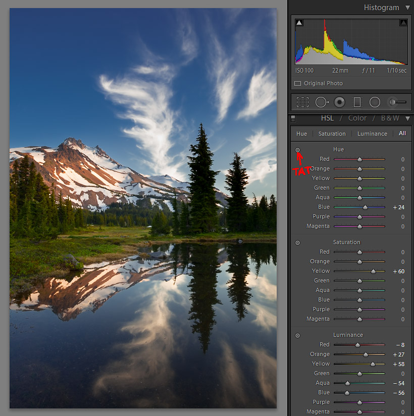
I’ll use an image from a 2010 Jeff Park (Mt. Jefferson Wilderness, Oregon) backpack to illustrate (Image 1). I re-processed this image recently before posting to 500px.
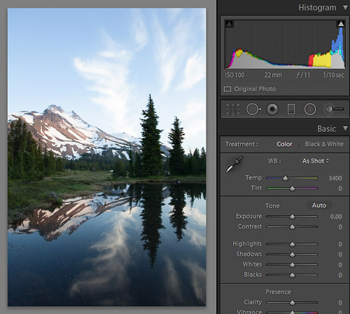
First I applied a standard scenic preset in Lightroom that punches up saturation, tones down highlights, adds a bit of shadow detail and removes chromatic aberration — basic stuff. Then to match the sky with the reflection, I use the Adjustment Brush, darkening the sky about a stop. The image also looks too cold — especially the mountain — so I warm it up by moving the Temp slider to the right (Image 2). Woo-hoo! On inspection, the image pops.
Or not. Really, what I’ve done so far is prep work, but now I can better assess the image, decide if it’s worth more work, dump it or get serious. I study the image. I ask myself what distractions can be removed (reduced); whether more contrast can enhance the image; where a burn or dodge might boost leading lines or direct the eye. I imagine Ansel casting a critical eye on his negative.
The tools for further enhancements are in the HSL/Color/B&W panel, and in the Adjustment Brush (for dodging/burning). Color, by the way, is HSL re-arranged; it’s the same tool. I ignore the Color tab because HSL is my routine; it’s the way I work. B&W is for black and white conversions, which we’re not dealing with here.
An obvious contrast enhancement would be to drop the blue sky luminance, thereby popping contrast between the sky and those fabulous cirrus clouds1, coincidentally enhancing contrast between sky and warm mountain as well. I click on Luminance in HSL, grab the blue Luminance slider and move it to the left (Alternately, grab the Target Adjustment Tool (TAT) by clicking on it, move it to the sky, and hold it down while moving the mouse down screen). Either way, blue luminance should drop like nightfall with dramatic effect. A separate issue with the sky in Image 2 is that the tone is too aqua, at least to my eye, caused by the warming we did globally with the Temp slider. I address this by switching to Hue, and, using TAT (or grab the blue slider), move toward purple until a deep blue permeates the sky.
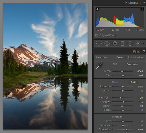
With great drama in the sky, can we do anything else? An enhancement of the meadow yellows may heighten appeal by increasing color (yellow/blue) contrast. Since the yellows are confined mostly to the meadow area where I’m seeking enhancement, I can accomplish this globally with local results. I increase the yellow saturation and then luminance, gained with the TAT or slider, pushing the yellows to a more prominent role in the final result. I like what I see now, Image 3. It’s a performance achieved.
1A polarizing filter can achieve a deep blue sky, but with a wide-angle lens the result is often uneven. For sky darkening, I prefer software techniques.