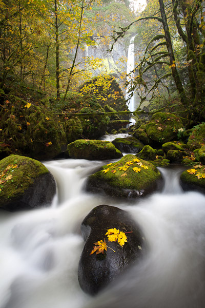
Shortly after a late October rainstorm, I visited the Columbia Gorge for some weekday waterfall shooting. Our first stop was Elowah Falls, a .8-mile hike up a boot-worn trail. After a half-hour of scouting, we got down to shooting at this photogenic spot. To my knowledge, the first photographer to get the “shot” from this spot was Charlie Gurche. I saw it in one of his calendars in the mid-ninety’s. My own first image here was in ninety-seven or -eight. The creek flow that day was just a trickle, but I got a pleasing image on Velvia film.
Much like that first trip, the big-leaf maples looked good, despite the storm knocking many yellowing leaves to the ground. Elowah falls, however, was dumping a lot of spray, and the lower (McCord) creek just gushed. Everything I composed showed way too much white, with the likelihood of blown out exposures and a certainty of distraction. The rushing water fixed my position (and hence my compositions) as well. Though my tripod legs seemed to handle the swirling water without shaking the camera, my feet couldn’t find purchase in the stream, or the water was simply too deep (and I was wearing boots that came up over my knees).
I headed for home that evening with crossed fingers. I was worried about the whites.
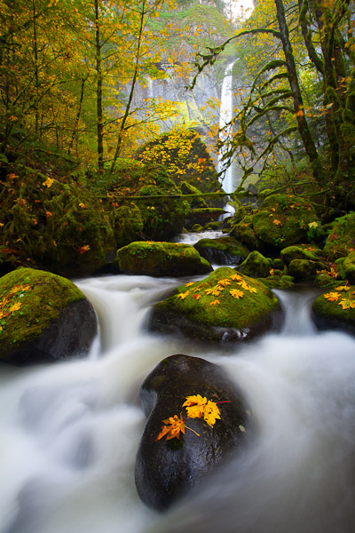
The opening photo (image 1) shows one of my selects, straight out of Lightroom 3. The whites look borderline blown—way too white and very distracting—just as I feared. Our eye is drawn naturally to light areas in a photo. In this case, with the whites on the edges, the eye may leave the photo entirely (i.e. We’ve lost the viewer). Additionally, the colors look so muted. For this image, the first thing I did in Lightroom was to move to the Develop module. In the Basic area, I set Exposure to -.25, Recovery to 17 and Fill Light to 8. Then in the Treatment area, I moved the Saturation slider to 50 (Image 2) (You could do all this in Library Quick Develop, but I don’t chose to use it). Now I have a better idea where I may be headed. I see the image isn’t at all lost.
The whites are still the big problem, though, in an otherwise well-composed image. If I can deaden the hotspots, and spotlight the central area, I may have a winner. The idea is to move the viewer’s eye into the picture, and hold it there.
Again in the Lightroom Develop module, I placed an Adjustment Brush button (pin marker) in the lower left corner, and then brush in areas in the lower part of the image that are light. I chose a large diameter (about 10) brush size, with feathering maxed at 100. I started with an exposure of -1, and after the fact decreased it to -1.15. By darkening the white water, the center of focus moves away from the corners to water more central. But did I want water to be the focus?
I think the best rendition would focus the eye on the yellow leaves and green moss in the central area. I put another Adjustment Brush pin there, and painted in the central rocks and leaves with a +1 so it would show easily, later reducing it to +.64. When I was done the central area had a nice bit of glow. I then looked critically at the image, and decided on some fine tuning. I dropped down to the HSL Color controls, clicked on Luminance, pushed up the Green to +30 and pulled down the Blue by -10. Why? Overall the greens were dark, and to emphasis them a bit more they needed a boost. Then, knowing the whites probably had a lot of blue in them, I could de-emphasize the whites further by “darkening” the blue (Note that it’s often best to play not with the sliders but with the target tool, where you drag up or down on an actual color point inside the image). We’ve got a lot of such tools in the toolbox, if we just know which to apply.
My final localized adjustment is to darken the small area of blown out sky, and the waterfall itself. I use the Adjustment Brush with Exposure at -.6, which seems about right. I’m really liking this (image 3 mouseover); the central area looks spotlit, yet the effect is subtle. I find the eye gets swept up into the center, and then lingers about, contained by the leaning trees, enjoying the scene.
One more thing—the leaves on the foreground rock. I placed them. Sometimes mother nature needs a boost, too.
Gary