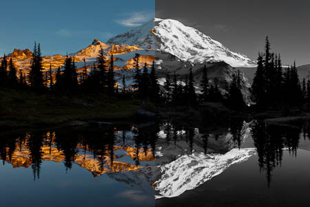
If Ansel Adams had had the darkroom power of Lightroom 3 to manipulate black and white imaging, he’d do a leaping victory dance like Jack Black in The Big Year. Ansel artfully dodged and burned his negatives, and controlled light in the field with filters, one filter per shot. Today, digital age tools boost control both in depth and in breadth. Selection tools get you dodging and burning at the pixel level. Smart post–shoot black and white conversion puts every color filter in play—simultaneously. No need for a green filter in the field to pop the foliage—push the green and yellow luminance in the office instead. Ansel’s red filter blackened the sky. Today we pull down the blue luminance for similar, dramatic effect. Have a red flower and green background that are roughly the same tone? No problem. Tonal separation is easy by manipulating color underlays independently. Lightroom, of course, isn’t the only avenue to black and white, but it may be all you need.
First, two essentials: shoot RAW, and compose carefully. Shooting in RAW assures shooting in color, which gives you the full range of control in processing. Shot and processed correctly, your black and white creations are monochrome interpretations of the underlying color. So if you have a camera with a black and white menu setting, don’t be tempted to use it. In-camera black and white generates a jpg that throws away color and hence throws away the color-based processing controls that are vital for creative black and white imaging. Shooting RAW also keeps dynamic range and white balance options intact. Don’t bake in jpg limits.
Black and white conversion erases color as a compositional element, and for me, color is huge. I love color, and punching color is pretty much axiomatic. Without color, other elements of design—the use of lines, shapes and contrast, for example—become all the more important. Paying attention to these elements in the field is crucial. Remember Ansel’s counsel that the negative (RAW file) is the composer’s score, the print (your image after adjustments) is the performance. You want to start with a winning score.
If you haven’t considered black and white, look over some color images and experiment with conversion. In Lightroom, use Crtl-‘ to create a virtual copy to work on, so you don’t mess up your prior color optimization. After converting a few images, you’ll get a feel for what works. One thing that works well is a sky with variable hues.
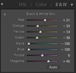
In Lightroom 3, the quick way to Black and White is the V key. Press V and your image desaturates. You can also click on Black & White in the Develop Basic panel, or B&W in the Develop HSL/Color/B&W panel. Each gets you to the same place. All allow full control of HSL/Color/B&W panel sliders, and an Ansel Adam’s dream: a monochrome image with individual luminance control of eight underlying colors.
Once Black & White has been selected, an Auto button at the bottom of the B&W panel can be clicked as a refinement starting point. However, I’ve found this moves the sliders in the wrong direction for most landscapes, lightening skies and darkening warm tones. I still like to have a look, though, so I click the Auto button, examine the result, and then hold down the Alt key and click the “Reset Black and White Mix” in the B&W panel to start over.
A worthwhile first step after the hitting the V key—but before going in for some serious, targeted luminance adjustments—is to play with Temperature and Tint in the White Balance section of the Develop Basic panel. These alone can dramatically alter the look of your black and white image.
When you enter the HSL/Color/B&W panel to manipulate the Black & White Mix sliders, the Targeted Adjustment tool is a preferred starting point. Click on its location in the upper left of the box, and use it to drag up or down on select areas of the image. I start with pulling down the blue sky, then move around the various tones pulling down or pushing up until I get a satisfactory result.
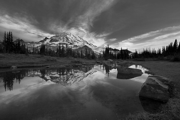
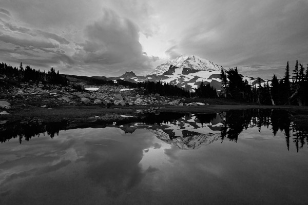
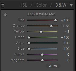
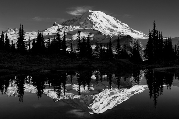
Example 1. In September, I captured this sunset image at Spray Park in Mt. Rainier National Park. The evening sky lacked warmth, but the clouds were interesting enough that black and white conversion popped in my head. After downloading to Lightroom, I used the V-key to enter B&W mode, and then in the Develop HSL/Color/B&W panel (now showing Black & White Mix), I manipulated the sliders, mainly pulling down the Blue and Aqua to darken and create more contrast in the sky. I also pulled down the Yellows and Greens a bit to darken slightly the mid-tone foliage. The quick adjustments gave me a pleasing result.
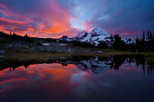
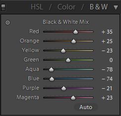
Example 2. The following morning I raced down from our cross-country camp to another tarn, arriving to capture this image just as the clouds went ruby-red. The sky was gorgeous, with a mix of reds and blues, and though you might never consider going black and white here, the color contrast lends itself to varying black and white interpretations. I show two here. In 2a, I used the Black & White Mix sliders to darken Blue and Aqua in the sky, and lighten the Red and Orange. I pulled down Yellow as well to darken the middle-tone grasses.
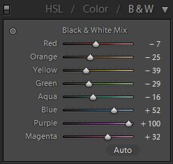
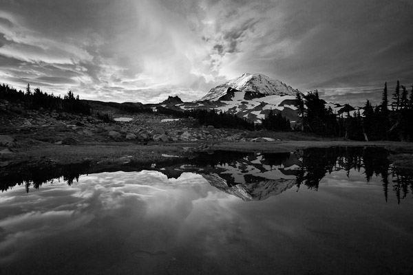
In 2b, I chose an opposite tact, darkening the warm tones—the Red, Orange and Yellows, and lightening the Blue and Purple. I also darkened Green, again to pull down the mid-tone grass. I prefer 2a to 2b, but both are valid interpretations. It’s also hard to fathom that both came from the same RAW file!
Example 3 is also from Spray Park, after an October snowfall left a few inches on the ground above 6,000 feet, and meltwater filled many tarns. At sunset, I was disappointed to see a cloudless sky. What to do with a plain sky? When faced with a gray sky while shooting color, it’s usually best to get rid of it. With a clear blue sky—color or black and white—I’d advise minimizing the sky. Just shrink it. So in example 3, instead of going big-picture wide, I zoomed to 34mm, filling the frame as much as I dared with Mt. Rainier. For the B&W conversion, I darkened the blues and lightened the reds and oranges, increasing the contrast. I also pulled down the greens, further contrasting the sunlit areas with the silhouette foliage in shadow. I’m pleased to say it reminds me of some of the fantastic Image Lake reflections of Glacier Peak, but, it’s not Glacier Peak, it’s the exquisite giant Mt. Rainier.
Lightroom has other tools for black and white. First, if after exploiting the Black & White Mix controls you still feel you need more, move down to the Camera Calibration (all the way down bottom left in Develop). Start with the Blue Primary slider, and move it back and forth to see the result it yields. Likewise with the Red, and try the Green as well. Second, the old dodge and burn for black and white still applies. Use the Adjustment Brush to select specific areas for lightening or darkening.
Another method entirely is to start over in color (click on HSL). Desaturate by moving all the color saturation sliders in the HSL/Color/B&W panel to zero, and then play with the luminance sliders much like you would the Black and White Mix sliders. Results, I’ve found, are similar, but after trying this numerous times and finding little difference, I’ve decided in general not to pursue this strategy. Note: Don’t desaturate your image using the Saturation slider in the Develop Basic panel. Doing so prevents manipulation of the underlying color luminance in the HSL/Color/B&W panel, the primary controls for black and white conversion.
Gary