Edited 3/3/2013. In the March, ’08 tip I discussed “the only filter”—the polarizer—a filter that hasn’t gone away with digital, and whose hallmark is a deep, blue sky. Of course, if this was the only thing a polarizer was good for, it would go the dustbin route of other filters. But a dramatic blue sky can be achieved in Photoshop, and especially in Adobe Lightroom.
I’ve been using Lightroom as my workflow processor since its release last year. I only shoot RAW, and every RAW image gets processed, keyworded and concommitantly cataloged in the Lightroom database. I’ll explore some of these in future tips, but for now, it’s deep blue skies I’m lusting for.
Dedicated image processors like Photoshop can achieve the deep blue by manipulating selected areas, or do it globally by manipulating select hues or colors. I’m going to use Lightroom because it matches my workflow. I can’t manipulate selected areas with Lightroom (this all changed with the release of Lightroom 2, which allowed selected areas for editing with the Adjustment Brush. See Lightroom 2, Whoo-hoo!), but I can pick a specific color and adjust its luminance (brightness) and saturation without affecting other colors. The Lightroom advantage is that you’re applying a recipe non-destructively to the RAW file, and—when you get it to your liking—apply that recipe to every similar photo in the shoot!
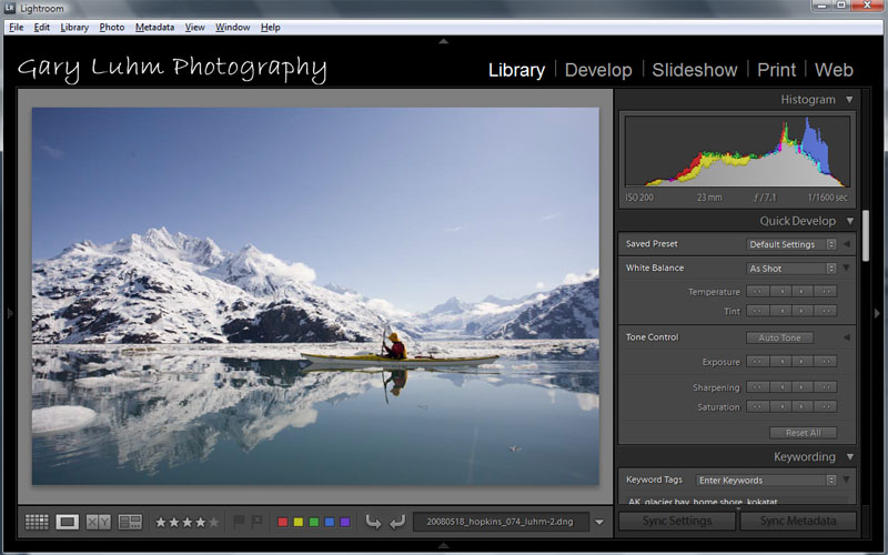
Here’s a digital image from a recent Glacier Bay, AK trip, as it looks right out of the camera and imported into the Lightroom’s library module (image 1). The accompanying histogram shows a well-exposed image, with more lights than darks (i.e. more pixels to the right on the histogram)—just what you’d want from a bright snow scene—and with nothing blown out.
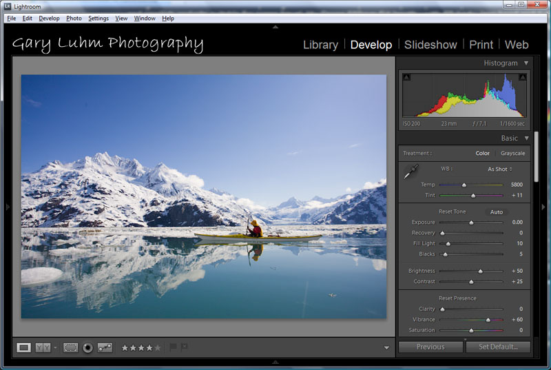
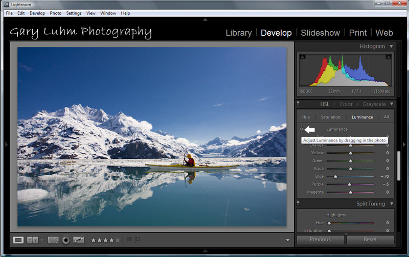
I click on Develop (or keystroke d), and the image moves to the Develop module. In the right (Basic) panel, I pump the dull colors by moving the vibrance slider to +60 (image 2). Quite a lot, perhaps, but it looks great, and vibrance doesn’t push colors over the top and gaudy like a saturation slider might. Because the kayaker is backlit, I push the fill light slider to 10, to add a bit more detail in the shadows.For the polarized effect, I scroll down panel to color adjustments, choose HSL (Hue, Saturation, Luminance), and click on luminance. I then click on the round circle thing in the upper left of the color box, move it into the blue sky area, hold down the left mouse button and pull downward. This reduces the brightness of the blues, and the sky goes dark as if polarized. I stop at -70, a big reduction (image 3). The white mountains now glisten against the deep blue. I could also have used the blue slider, but the spot selection tool I did use is a handy instrument.
At this point I could declare victory; I believe I have a marketable image, one with impact. In reality, I may play more with the luminance and saturation, perhaps to further saturate the aqua of the silty water, and/or brighten the reds and yellows in the kayaker to heighten the contrast of warm on cool.Gary